Moneyfest.
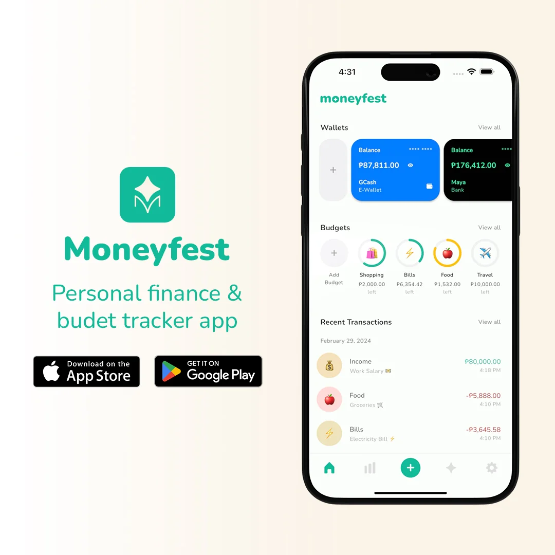
A peso-first money tracker for Filipinos managing cash, banks, and e-wallets in one place. Co-founded with my partner after years of tracking our money in separate spreadsheets, Moneyfest grew into a live product that reached Top 8 in the App Store PH Finance category.
Role
Co-founder · Designer
Scope
Brand · Product · Marketing
Status
Growing
Timeline
2023
01 · Context
Built from two different spreadsheets.
My partner and I were both tracking our money, but not in one perfect shared spreadsheet. We had separate systems, separate categories, and separate ways of making sense of spending. That became the insight behind Moneyfest: people do not need one correct way to manage money. They need a tool flexible enough to feel like the system they already trust — but easier to use every day.
Free to use, no ads, no upsells. Built for how Filipinos actually manage money — peso-first, fast to log, and familiar from the first setup. We did not localize the app through Tagalog. We localized it through defaults: GCash, Maya, and local bank templates beside cash and savings wallets. As co-founder and lead designer, I owned the brand, product experience, and launch creative.
Top 8
App Store PH, Finance category
80K+
downloads since launch
4.8
average user rating
02 · Process
How the product took shape.
- 01
Insight
The product started from two different spreadsheet habits. Instead of forcing one correct system, we designed for flexible personal tracking.
- 02
Principles
The design needed to be peso-first, fast to log, familiar during wallet setup, and softer than a bank app.
- 03
Product
We focused the core flows around daily tracking: wallet setup, transaction entry, categories, and quick review screens.
- 04
Launch
We launched on the App Store first, then brought Moneyfest to Android after repeated demand from users who wanted to track on their own devices. The rollout was paired with founder-led content across TikTok, where the story helped people understand why the product existed.
03 · Brand Identity
A friendly money habit.
A working snapshot of the visual system behind Moneyfest. The goal was to make money tracking feel approachable, clear, and easy to return to — less like a bank interface, more like an organized everyday tool.
Logo
moneyfest
PRIMARY LOCKUP

WORDMARK

SYMBOL
Color
Primary Teal
#1FC8A0
Soft Teal
#A3E8D7
Surface
#F8F4ED
Black
#0E0E0E
Blue
#1E90FF
Pink
#FBC8C8
Yellow
#F6D374
Purple
#8C7CFF
Red
#E84B4B
Teal does the brand work; everything else supports habit-building. Category colors, account cards, and chart segments help users recognize patterns quickly without making the product feel corporate or overly technical.
Typography
Nunito
Sole typeface across product and marketing.
Black weight anchors currency values and primary numerical UI. Bold creates clear section hierarchy. Regular supports body, helper text, and microcopy. The contrast keeps the product readable without feeling heavy.
Principles
- 01
Friendly, not childish
Soft colors, rounded cards, and generous spacing help money tracking feel calm without making the product feel unserious.
- 02
Localized by defaults
The app stays in English, but the setup feels local through pesos, e-wallets, and Philippines-relevant wallet templates.
- 03
Fast daily logging
The UI prioritizes the repeated habit: add a transaction, choose a wallet, pick a category, and see the balance update.
04 · Key Screens
Designed around real money behavior.
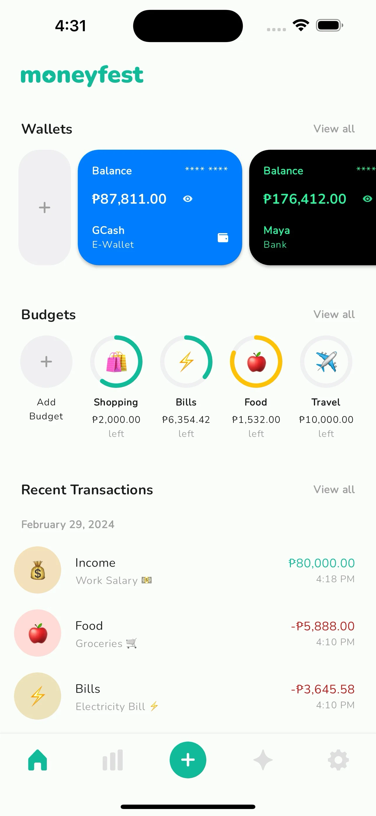
Home
Wallets at a glance, budget rings at the top, recent transactions below. The whole financial day on one screen.
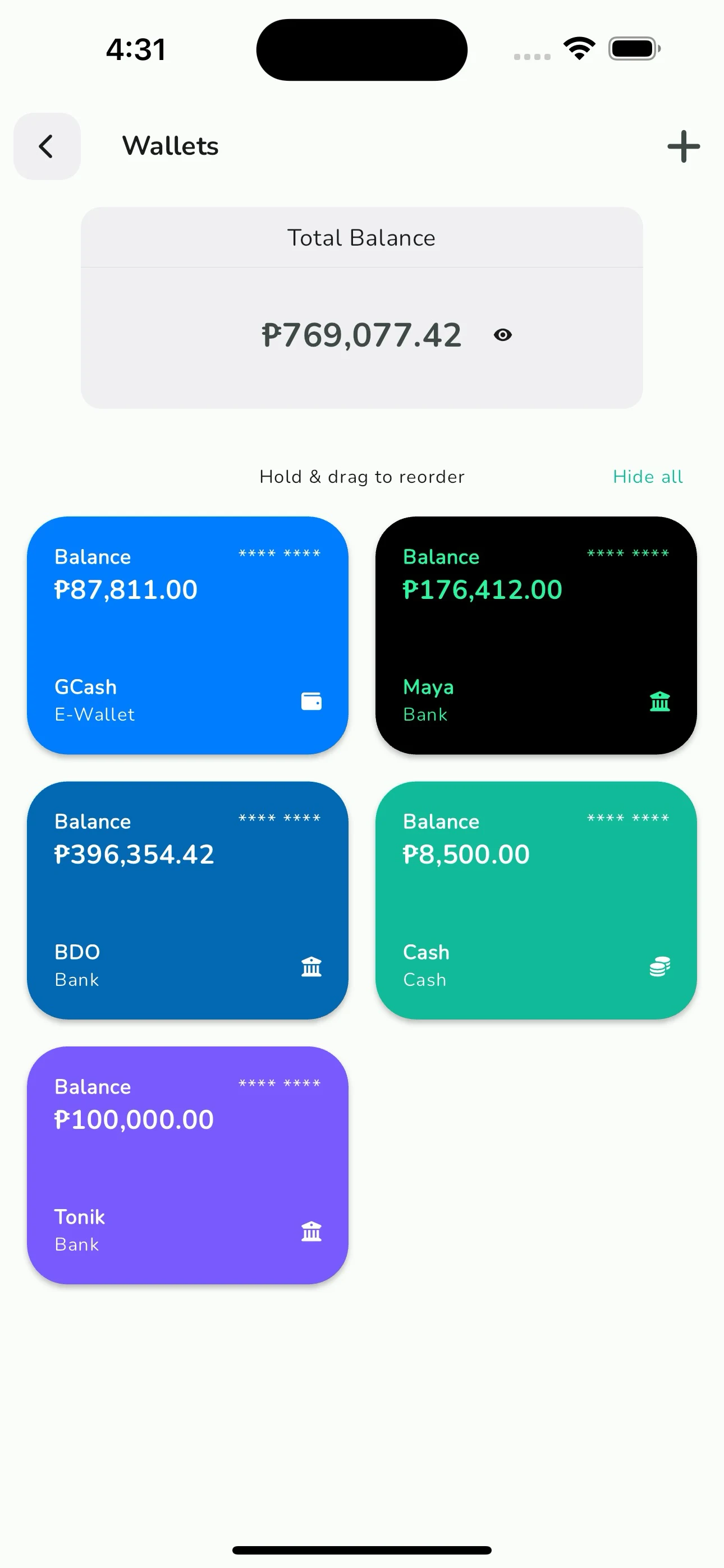
Wallets
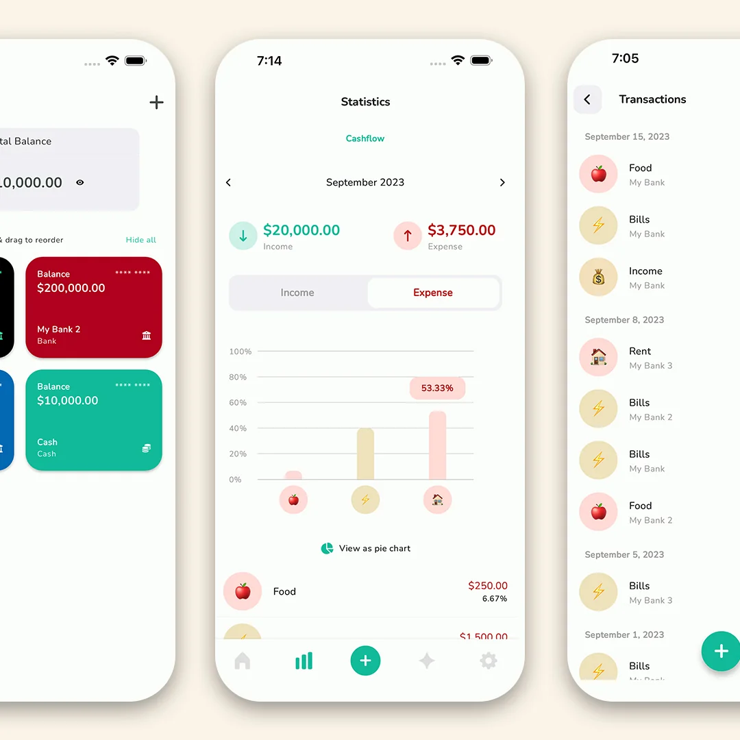
All accounts side by side — each in its bank's own color. Drag to reorder, hide what you don't want to see today.
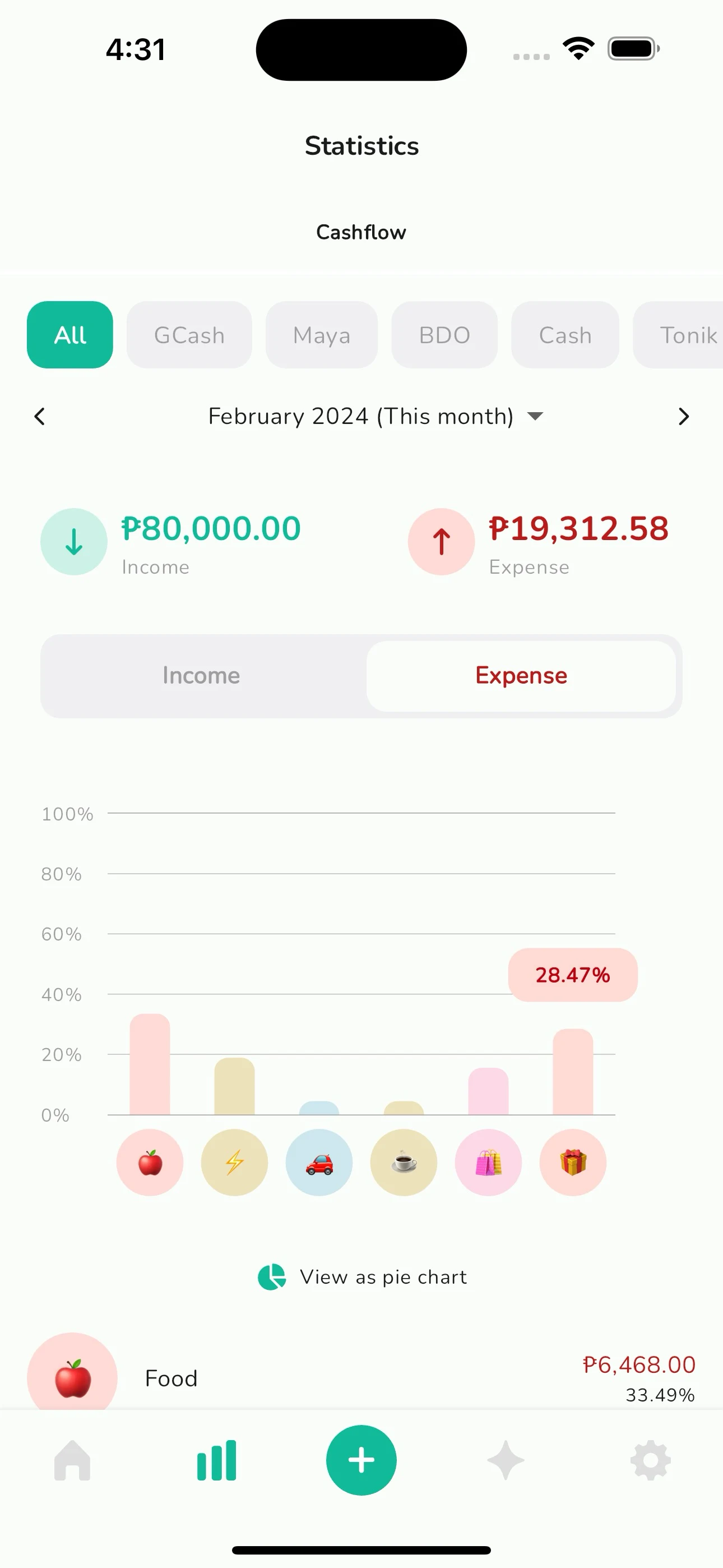
Statistics
Cashflow at a glance. Filter by account, toggle income vs expense, see where the month actually went.
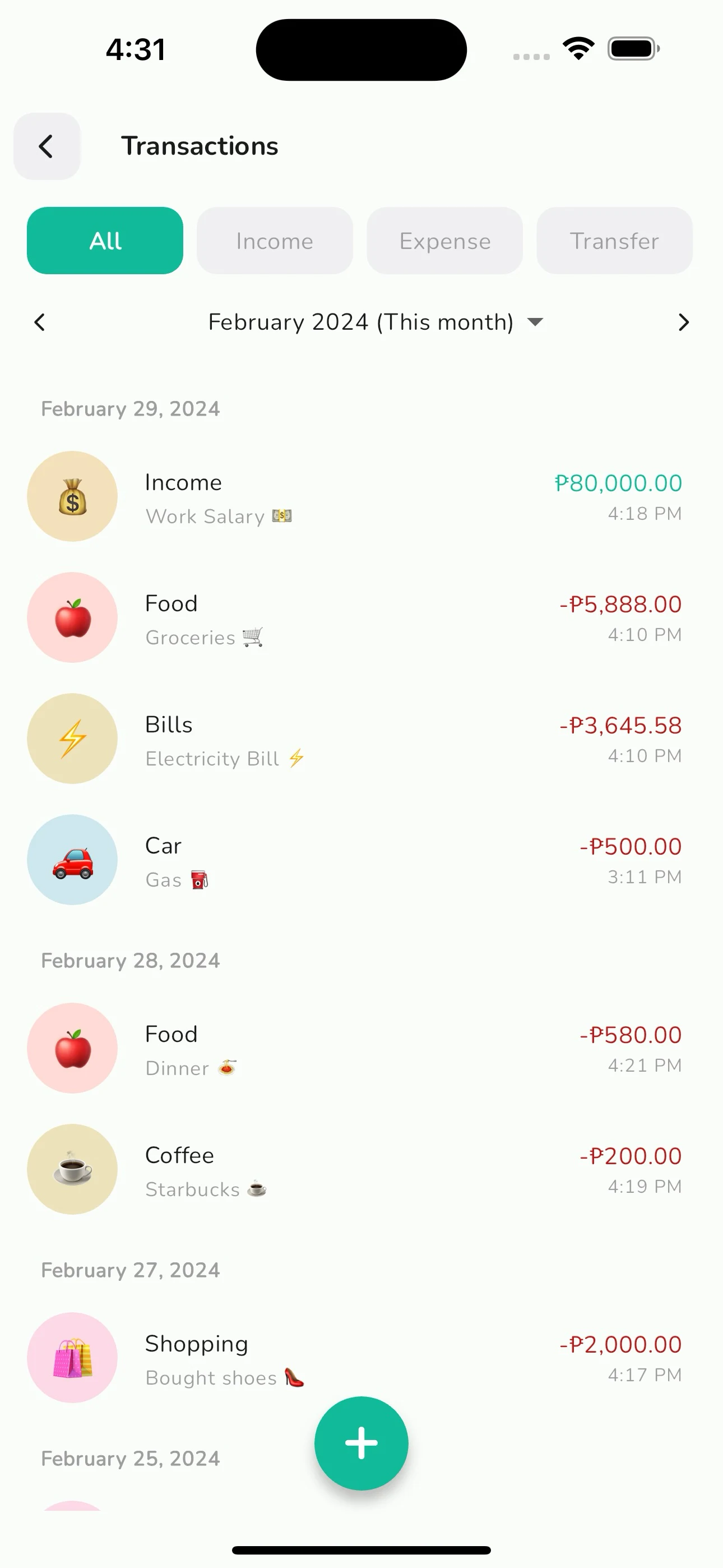
Transactions
Every peso, grouped by day. Auto-categorized with emoji, editable in two taps, nothing scary in red.
05 · Marketing Creative
From founder story to feed.
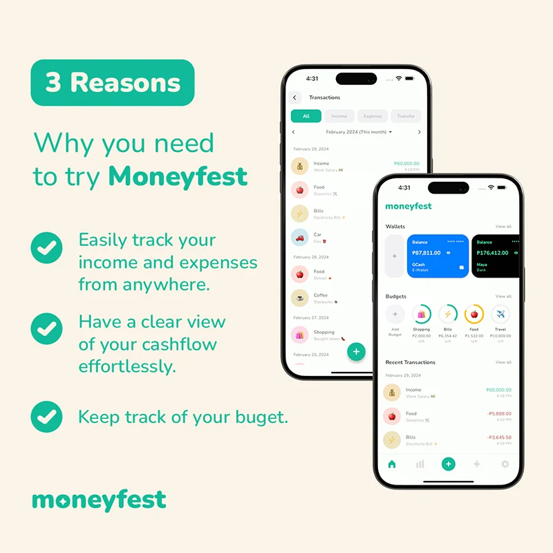
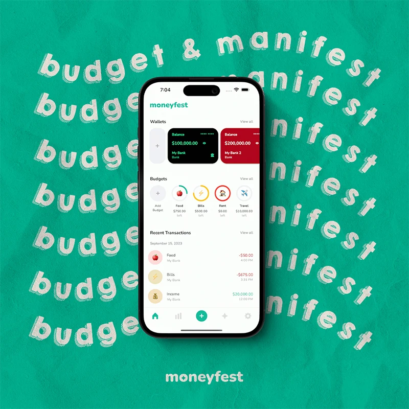
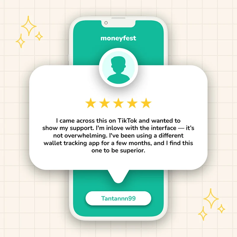
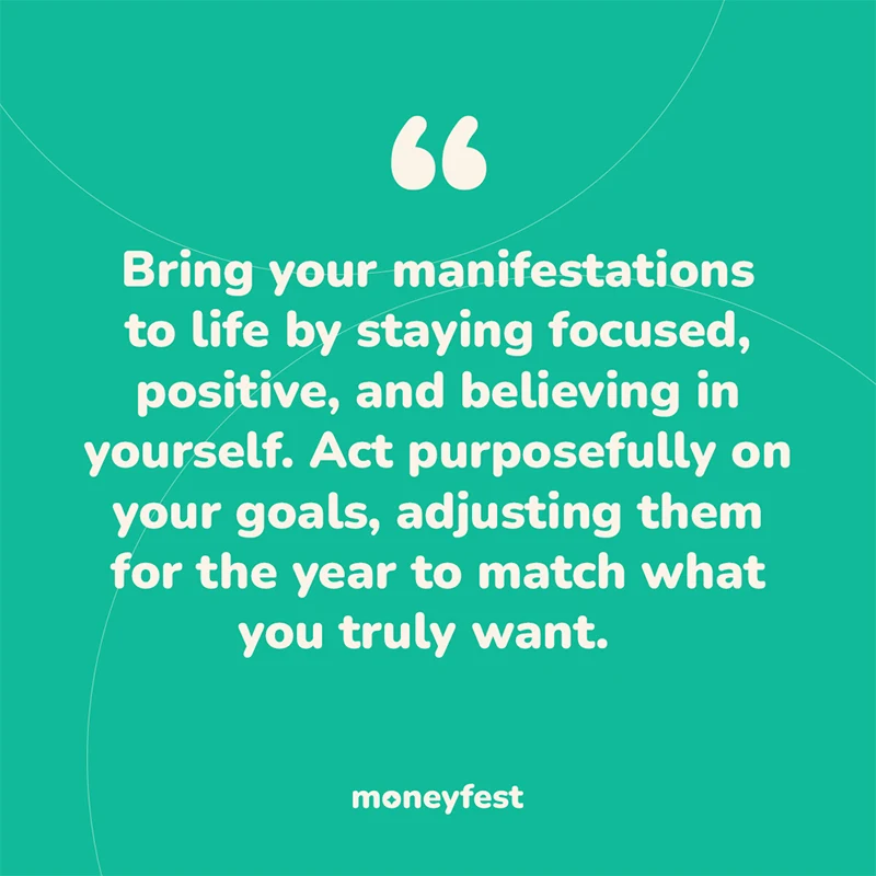
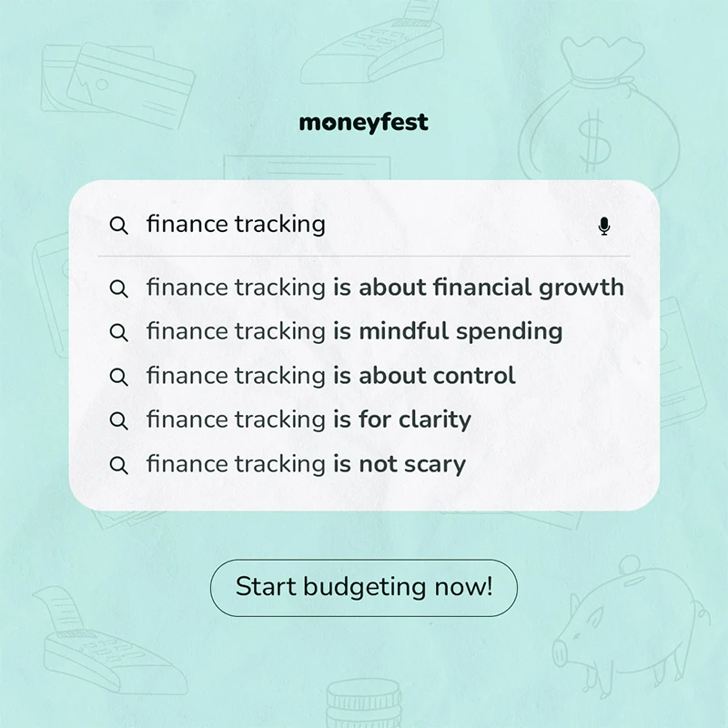
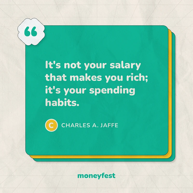
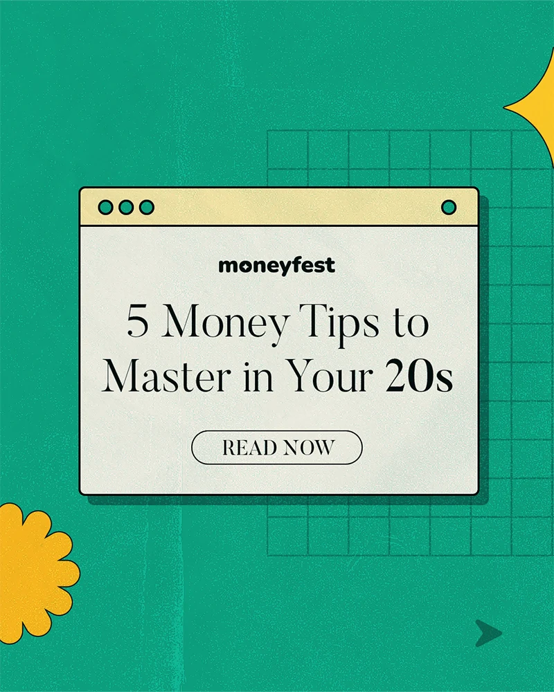
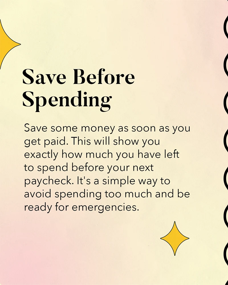
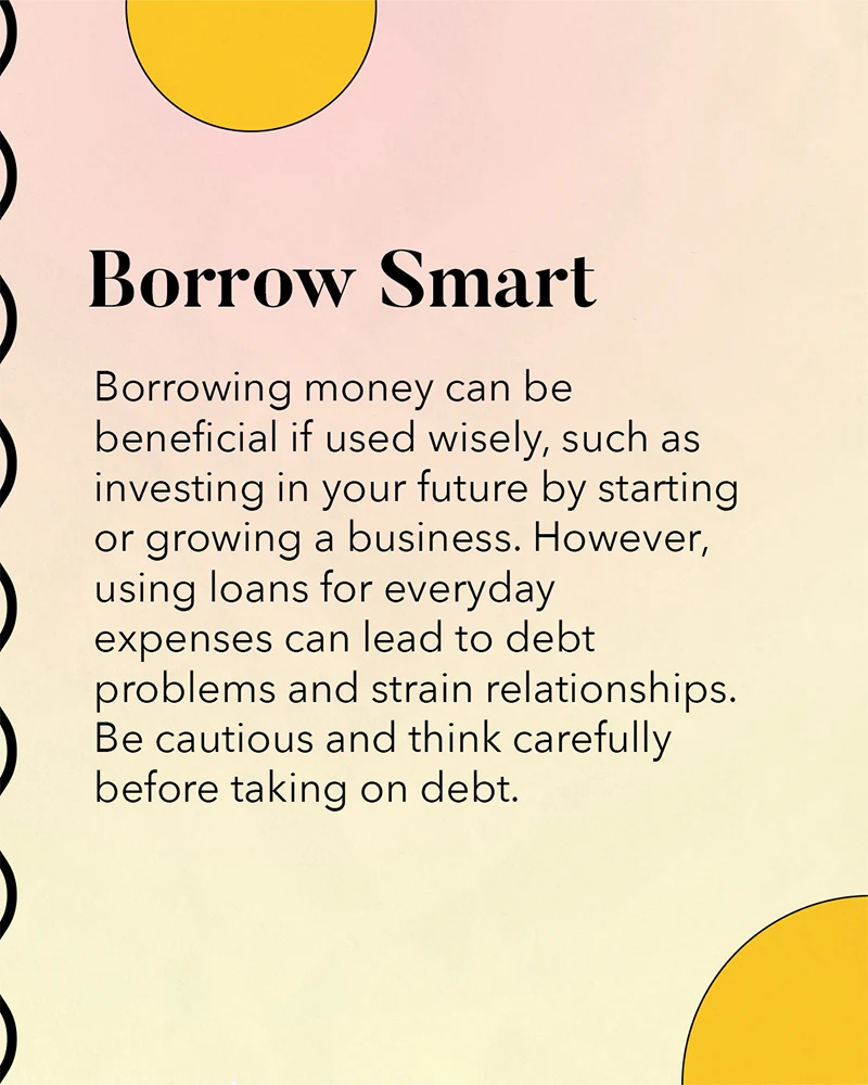
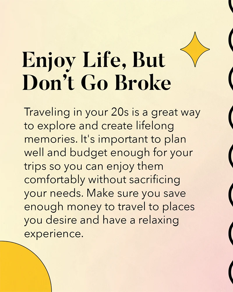
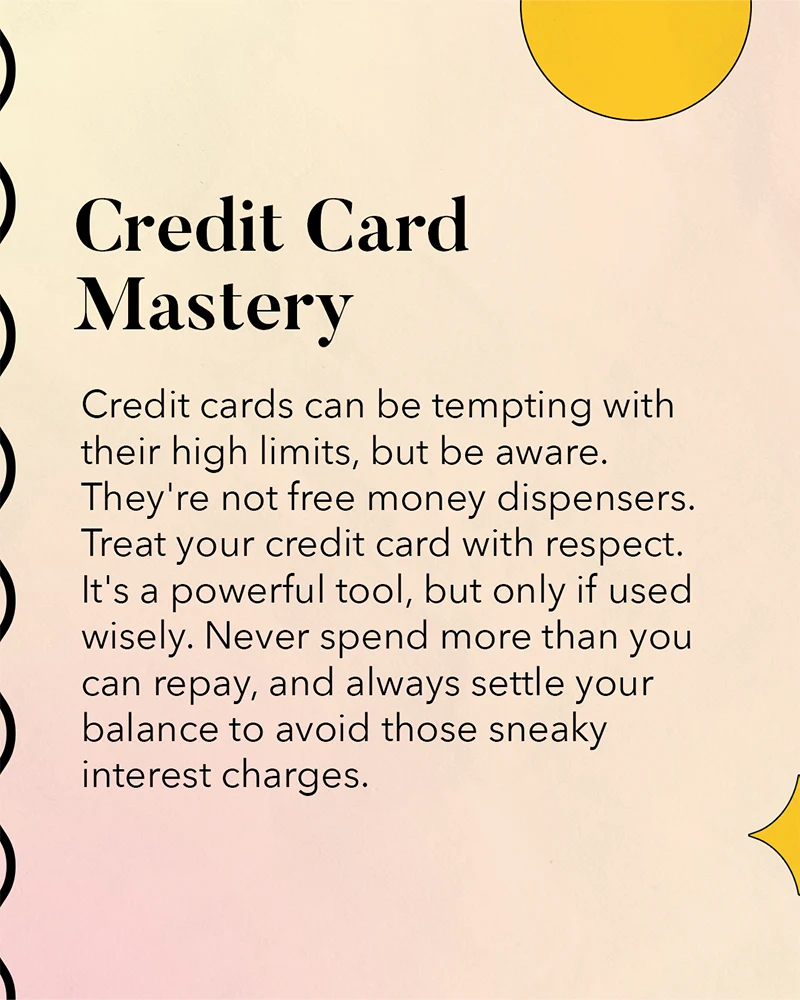
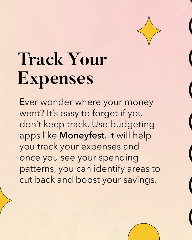
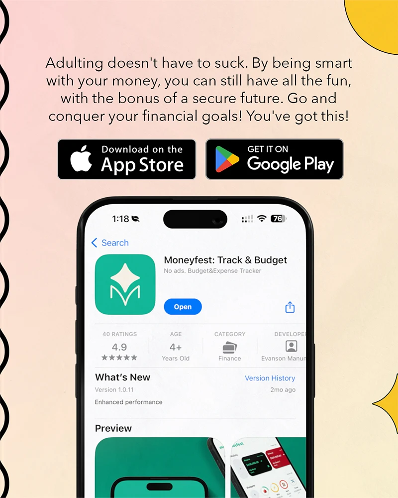
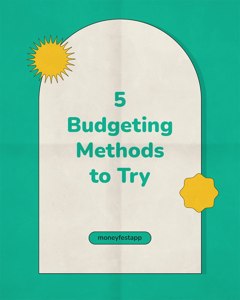
Selected statics, carousel posts, GIF stills, and TikTok thumbnails from launch and growth campaigns. The strongest creative angle was not just product features — it was the relatable story of turning spreadsheet habits into a tool for Filipino money tracking.
Featured carousel · 7 slides
Long-form carousel post — scroll right to view all slides.
- 1 / 7
- 2 / 7
- 3 / 7
- 4 / 7
- 5 / 7
- 6 / 7
- 7 / 7
Featured carousel · 6 slides
Long-form carousel post — scroll right to view all slides.
- 1 / 6
- 2 / 6
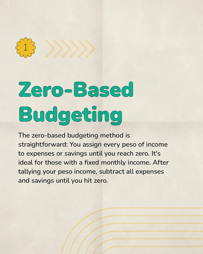
- 3 / 6
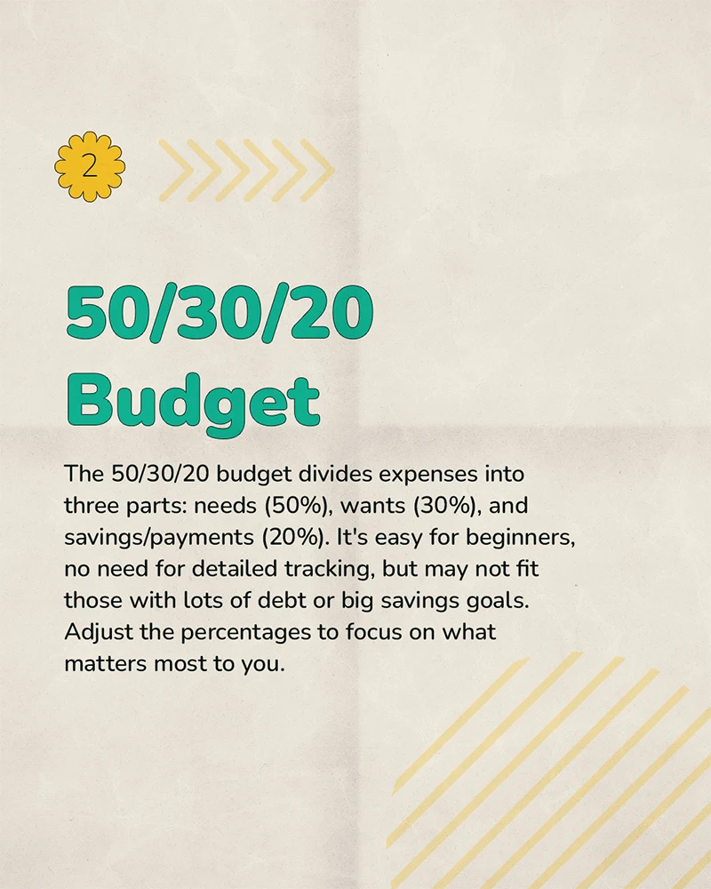
- 4 / 6
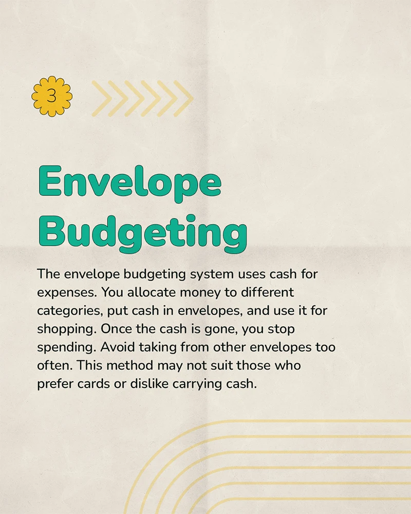
- 5 / 6
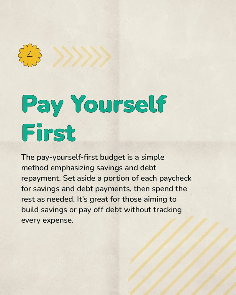
- 6 / 6
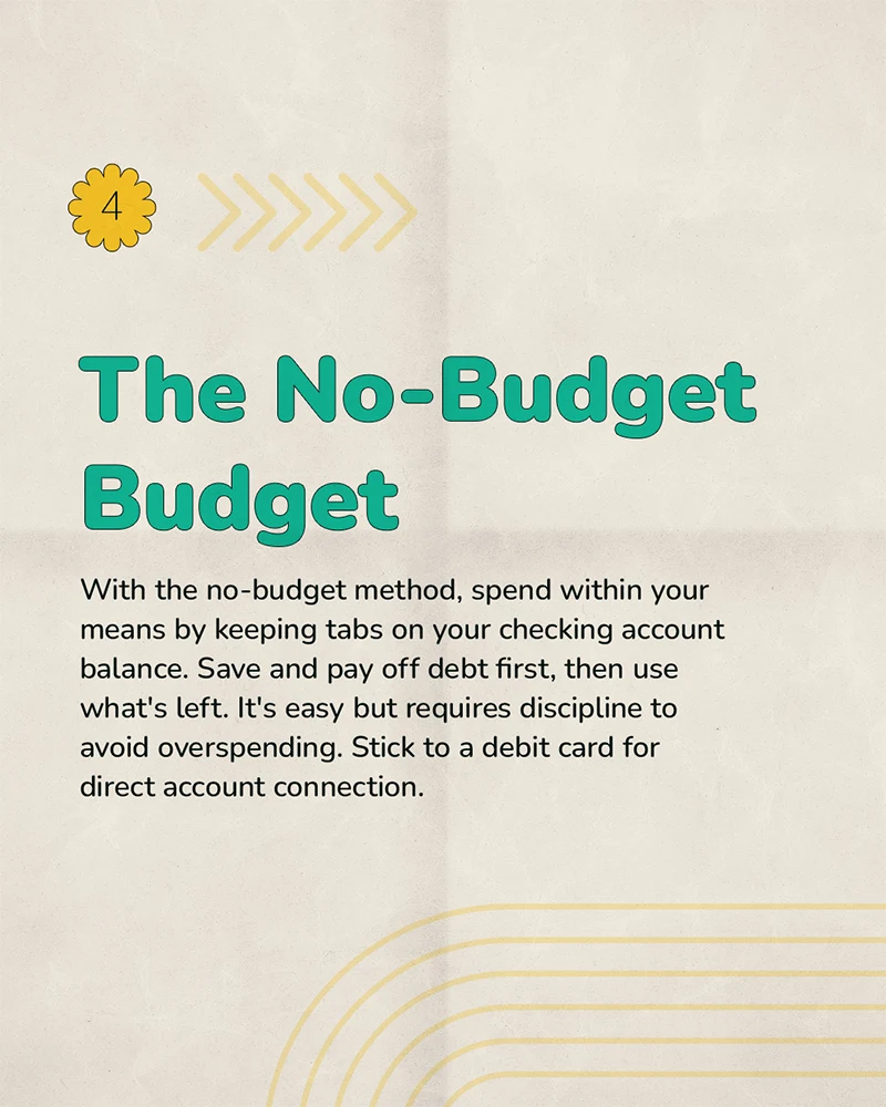
New Year's Resolution
Switch to Moneyfest
Tutorial Part 1
Tutorial Part 2
Budget Challenge
Showcase video · 16:9
App walkthrough — showing how wallets, transactions, and daily tracking connect.
06 · A Design Decision
Moneyfest was localized through behavior, not language.
We did not make the app feel Filipino by switching the interface to Tagalog. We made it feel Filipino by respecting how money is actually organized: pesos everywhere, GCash and Maya beside traditional banks, wallet templates that match local accounts, and flows that support quick daily logging. The goal was not to make the app sound local — it was to make setup feel immediately usable in the Philippines.
07 · Reflections
What users taught us after launch.
Setup speed matters.
Users need to see their real money setup quickly. Wallet templates reduced the blank-page feeling and helped the app feel useful from the first few minutes.
Wallets are emotional.
Wallets are not just accounts. They reflect how people mentally separate money for spending, saving, bills, emergencies, and everyday cash.
Habit-building is the product.
The most important moments were not the most complex screens. They were the repeated actions: adding a transaction, checking a wallet, reviewing spending, and feeling encouraged to continue.
Next case study
Goodboy Gravies.
A starter-kit landing page where the brief said "clone the competitor" — and the work became "redesign the brand."