Goodboy Gravies.
A starter-kit landing page for a dog food topper brand. The brief was "clone this competitor page" — the project quietly became "build the cleaner version of your own current LP."
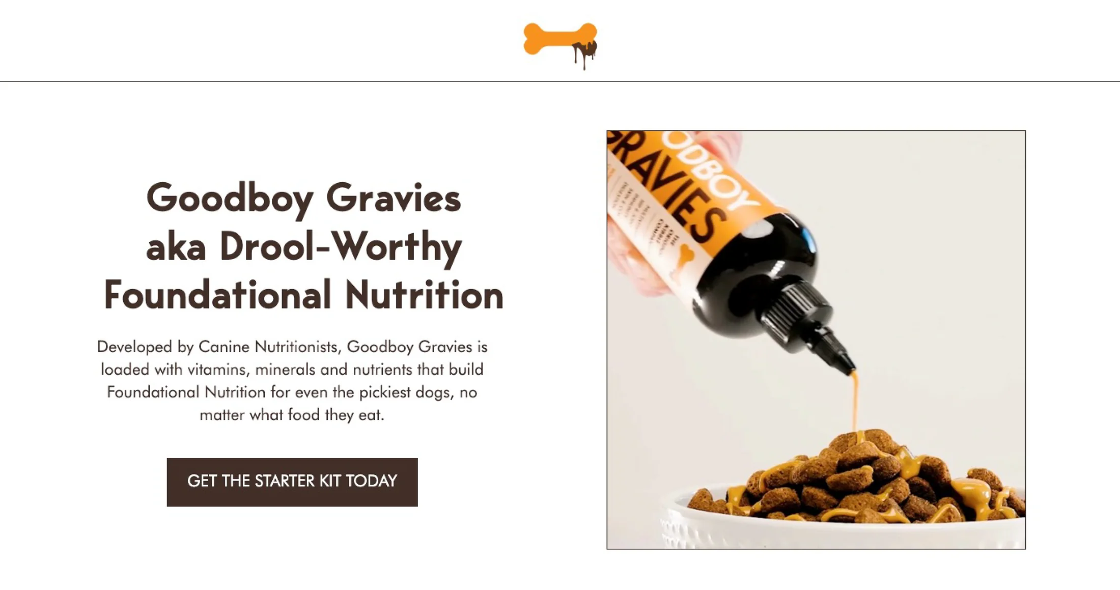
Client
Goodboy Gravies
Agency
Primer
Role
Designer
Year
2024
Output
Desktop + mobile LP
01 · The Brief
Clone this page.
The brief was almost literal: “Please clone this page.” The reference was Armra's founder-story landing page — a clean, generously-spaced welcome-kit LP. Goal: push Goodboy Gravies' Starter Kit, with the same elegance.
The CD added a layer of design direction in PINK on top of the doc — every section called out a tint, a typographic move, a structural rule. “Use the dark brown for the BG.” “Make the headline smaller than the subheadline.” “Have these be small white circles with a thin dark brown outline.” The brief wasn't a starting point; it was a near-final spec.
The LP · 8 sections
- Section 1Hero — “Your Dog’s New Favorite Supplement”
- Section 2Why Goodboy Gravies — 4-benefit carousel
- Section 3The Decision Your Pup Would Make — Starter Kit
- Section 4How It Started — founder story
- Section 5How It Works — 3 steps (Sniff · Drizzle · Savor)
- Section 6Tail-Wagging Reviews
- Section 7FAQ
- Section 8Final CTA — “Your Dog’s Wellbeing is One Drizzle Away”
02 · What Was Already There
A cleaner version of an existing LP.
Goodboy Gravies already had a live LP at the time. It worked, but it was busy — the kind of page that's been added to over time, with each new section borrowing a slightly different tone. The Armra reference offered the opposite: generous whitespace, calm hierarchy, one clear job per section.
So while the brief said “clone this competitor,” the actual project was “give Goodboy the cleaner LP they don't have yet.” Same brand, same product, same content — different breathing room.
“The brief said clone the competitor. The opportunity was to redesign the brand.”
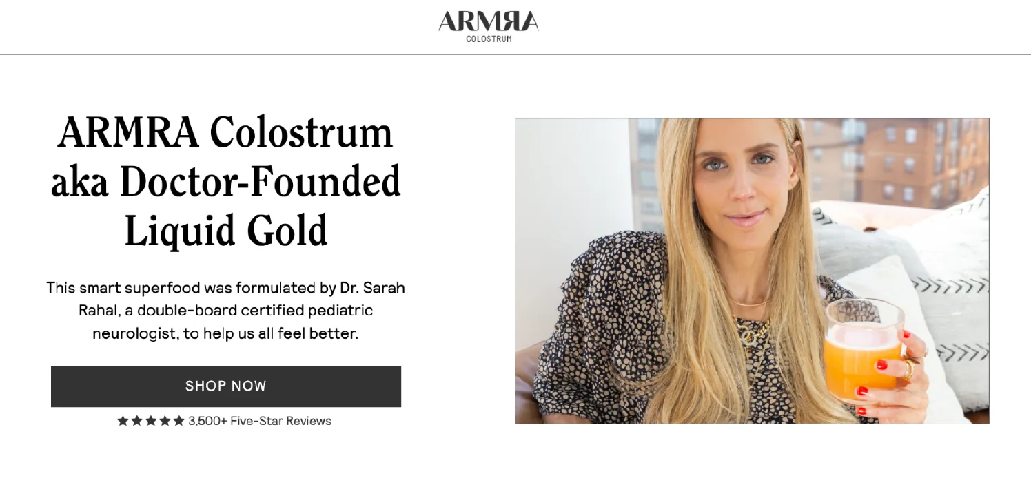
The Armra reference · “please clone this”
03 · Design Decisions
Where the brief got translated.
01
Cream over white. Brown over black.
The Armra reference used black on white. The CD's note: “Use their dark brown in place of all the black you see here.” That single swap kept the structural elegance of the reference but reset the temperature. Black-on-white feels clinical; brown-on-cream feels like a real product on a kitchen counter. Same hierarchy, completely different room.
02
Generous whitespace, anywhere it fit.
The brief explicitly called this out: “having the white space and padding on both sides is key. Also not using big text.” In a category where most LPs are stacked solid edge-to-edge, restraint reads as confidence. Every section got room to breathe — even the dense ones like the Starter Kit detail.
03
Hierarchy by weight, not by size.
Most product LPs scream from the top: huge headline, huge CTA, huge product shot. The CD called for the inverse — smaller eyebrow, larger benefit copy underneath. “Why Goodboy Gravies? · 4 Life-Changing Benefits.” The benefit text leads, the section label supports. Reads like an editorial, sells like a landing page.
04
Two background tints. That's it.
The whole page alternates between cream and a slightly deeper tan (#E8DED2), with the dark brown reserved for two punchier sections (How It Started + Reviews). Three colors structuring eight sections. The discipline is invisible until you compare it to the original LP — and then it's the whole point.
04 · The Output — Desktop
The full landing page.

05 · The Output — Mobile
The same page, smaller.
Mobile takes the same content and lets each section breathe on its own screen. Same hierarchy, same color discipline, no compromises in the squeeze. Three phone placeholders below — each one ready to receive a real mobile screen export.

Hero + Why

Kit + Story

Reviews + CTA
06 · A Quiet Win
“Our Creative Director pulled this LP up at a design meeting as one she'd liked recently — said it might be useful as inspo for other LPs. That was the moment I knew it had landed.”
I don't have performance data on this one, and that's not the part I'd share even if I did. The thing I'm proud of is more boring and more lasting: another designer might pull this LP up later and use the structure as a starting point. That's how a design system gets built — not from a top-down decree, but from one project that quietly becomes the reference for the next.
Credit where it's due
A lot of what makes this LP work came from the CD's notes on the brief — the brown-over-black swap, the small-headline-large-subheadline rule, the carousel-as-circles direction. The design is mine; the direction was a real collaboration.
Next case study
Apostrophe.
A 3-slide carousel that quietly outperformed — and stayed in my own inspo folder for years.