Apostrophe.
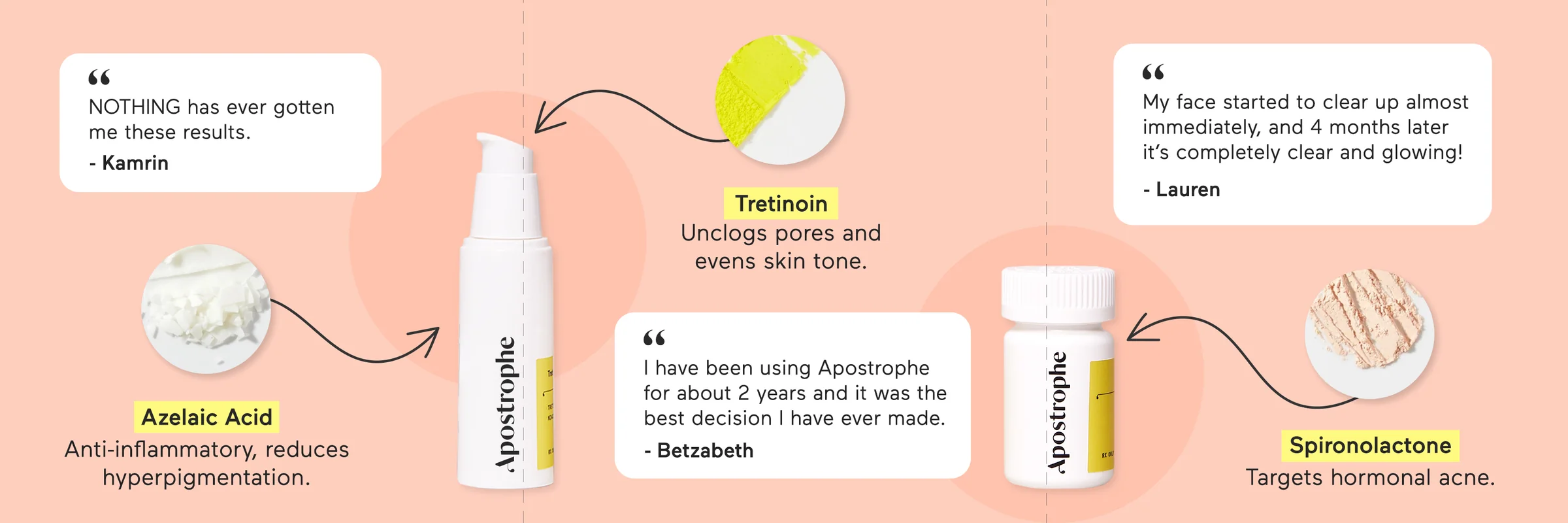
A 3-slide carousel for a dermatology-led skincare brand. The kind of ad that quietly outperforms its slot — and ends up in your own inspo folder for years after.
Client
Apostrophe
Agency
Primer
Role
Designer
Year
2021
Format
3 statics · 1:1 carousel
01 · The Brief
What was asked.
Three statics for a Meta carousel ad — each one centered around a different active ingredient: Tretinoin, Spironolactone, Azelaic Acid. Each slide also had to work standalone, in case it ran on its own outside the carousel.
The product team supplied ingredient photography, product shots, and a shortlist of UGC testimonial quotes. The ask: each frame should show the ingredient, a benefit, the product, and (if there's room) a real customer quote.
The constraints
- Three statics, one per active ingredient
- Each must work standalone AND as a carousel
- Show ingredient + benefit + product per frame
- Layer in UGC quotes if space allows
- Modeled after a Sunday lawn brand carousel — image bleeds across frames
02 · The Inspiration
A lawn brand pointed the way.
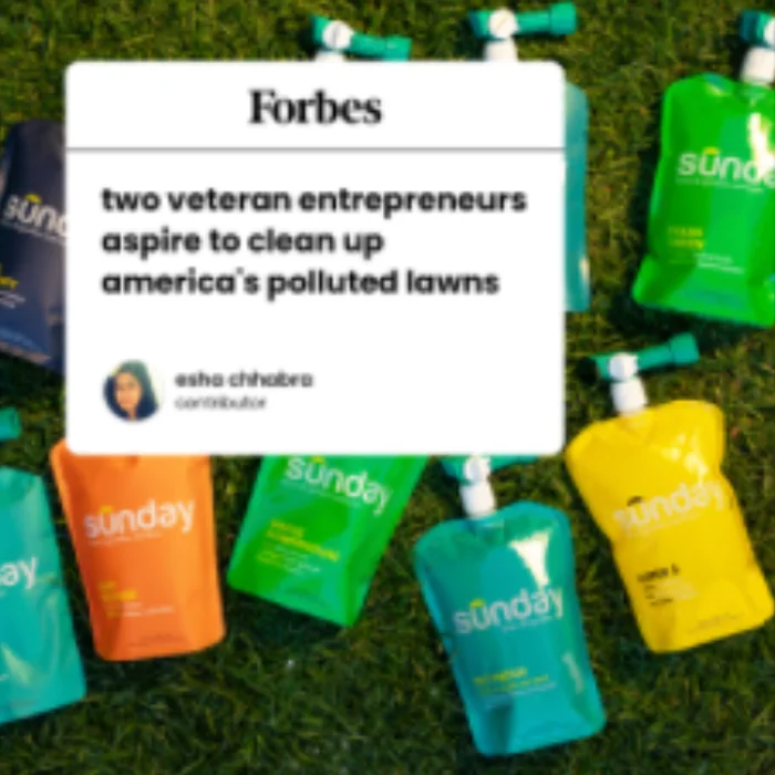


The brief came with a reference: a Sunday Lawn Care article carousel that made three magazine-style panels feel like one continuous spread. The image bled from one frame to the next, products got room to breathe, and quotes carried the social proof.
That cohesion was the unlock — but a literal port wouldn't work for skincare. Sunday's voice was bold and editorial. Apostrophe needed something softer, more personal. The aesthetic had to feel like a friend showing you what's actually in their product, not a magazine telling you to buy.
“Take the structural idea — a connected carousel — and translate it into a softer, hand-drawn skincare voice.”
03 · The Approach
Four design decisions.
01
A peach base, not a clinical white.
Most prescription skincare leans clinical — white backgrounds, blue accents, hospital energy. Apostrophe's product was prescription-grade but their voice was warmer. Peach gave the carousel a unified canvas that felt skin-toned, calm, and unmistakably not-a-pharmacy.
02
Yellow highlight on every ingredient name.
Active ingredients are the substantive thing, but they're also intimidating words. Spironolactone doesn't roll off the tongue. The yellow highlighter treatment did two things at once: gave the eye a clear hierarchy in a busy frame, and softened the medical names by treating them like a student's notebook callout.
03
Hand-drawn arrows from ingredient to product.
Sunday's reference used clean callout boxes. Apostrophe needed something more personal. Wonky, hand-drawn arrows pointing from each ingredient circle to the product made the ad feel like someone had marked up a page for you — not designed an ad at you. A small move that did a lot of work.
04
Products bleed across all three slides.
This was the structural idea borrowed from Sunday: position each product so it sits half on its slide, half on the next. The eye is invited to swipe. When you scroll the carousel, it reads as one continuous shelf rather than three disconnected ads. Standalone, each is complete; together, they're a story.
04 · The Final Ads
The carousel, slide by slide.
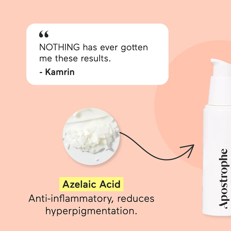
SLIDE 1 · Tretinoin
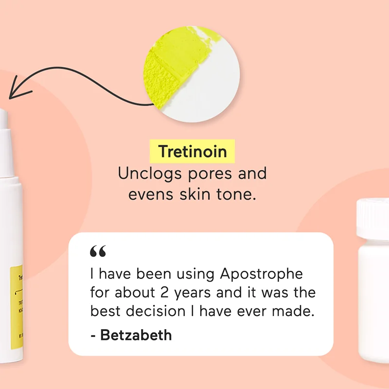
SLIDE 2 · Spironolactone
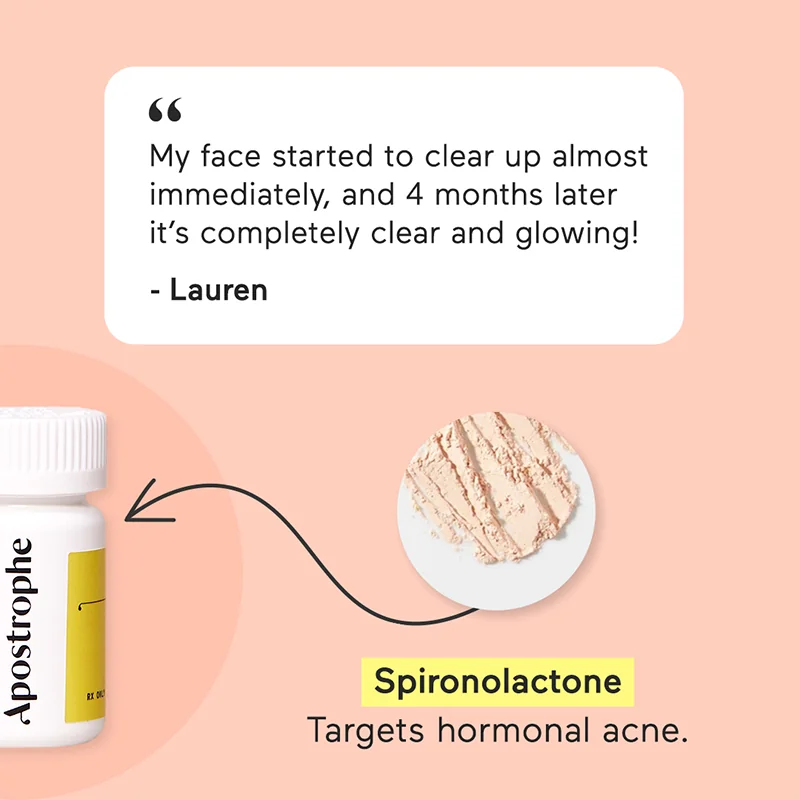
SLIDE 3 · Azelaic Acid
05 · The Impact
“It quietly outperformed its slot — the kind of ad you don't expect to be a hero, and then it is.”
The performance numbers belong to Apostrophe and aren't mine to share, but the short version: the carousel beat its category benchmarks on engagement and stayed in rotation longer than most ads of its vintage. The brand kept reordering ingredient-led variants in the same format for years after.
06 · The Legacy
It became my own reference.
Two years after the Apostrophe carousel went live, I was briefed on a Four Sigmatic ingredient-education ad. Different brand, different category, different audience — but the same fundamental problem: how do you make active ingredients feel approachable in a 1080×1080 frame?
I went back to the Apostrophe deck. Not to copy it — the brand voice was completely different — but to remember the structural moves that worked: the highlighted ingredient names, the connection-by-arrow, the products that earn the centerpiece. The actual ads are below.
A good ad isn't just a one-time deliverable. If it works, it becomes a system you can lift the bones from for years.
APOSTROPHE · 2021
TretinoinActive ingredient education,
carousel format
FOUR SIGMATIC · 2023
Lion's ManeSame bones, different
palette and audience
The Output · 2023
Same bones, dressed differently.
Two years after Apostrophe, the Four Sigmatic ingredient ads borrowed the same structural moves: ingredient circle, hand-drawn arrow, highlighted name, product bleeding across the frame. Different brand, different palette, same logic.
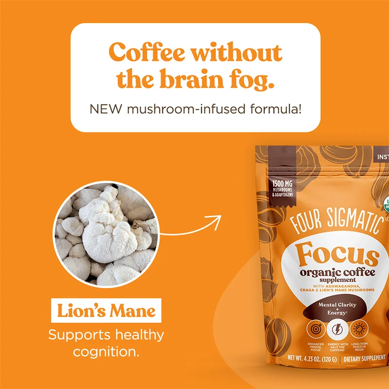
SLIDE 1 · LION'S MANE
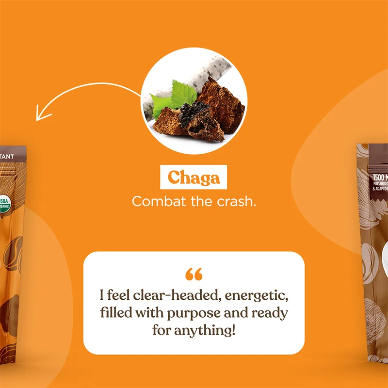
SLIDE 2 · CHAGA
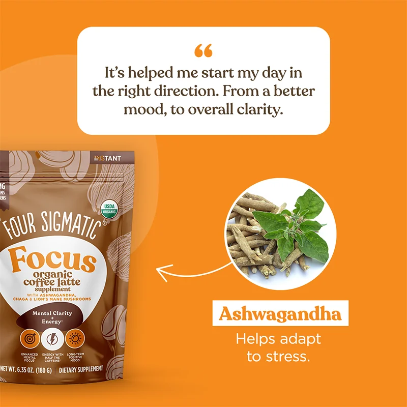
SLIDE 3 · ASHWAGANDHA
Next case study
Primer Growth.
A 30-second video where the headlines were given and the transitions were the work.